

無料Tableau Desktop-Specialist日本語テスト練習問題試験問題集
試験準備には欠かさない!トップクラスのTableau Desktop-Specialist日本語試験最新版アプリ学習ガイドで練習
質問 # 78
データセットを使用して、地域ごとに分類された平均数量を示す棒グラフを作成し、国ごとにフィルタリングして日本のみを表示します。東京州の平均数量はいくらでしたか?
- A. 3.704
- B. 3.500
- C. 3.840
- D. 3.000
正解:A
解説:
Explanation
Since we need to focus on 1 country -> Japan, let's filter on it first as follows:
1) Drag Country to the filter shelf, and choose only Japan. Click OK.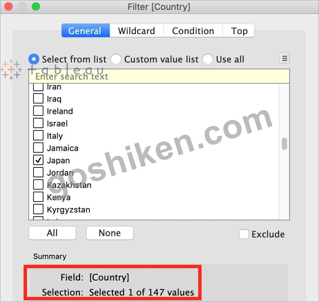
2) Read the Question Carefully, we need to break down the visualisation by Region, then by Country, and then by State. So let's do that:
Drag Region to the column shelf, followed by Country. Drill down into Country to include states as well.
Then drag Quantity to the Row Shelf, and change the Aggregation to AVERAGE.
The following is our visualisation: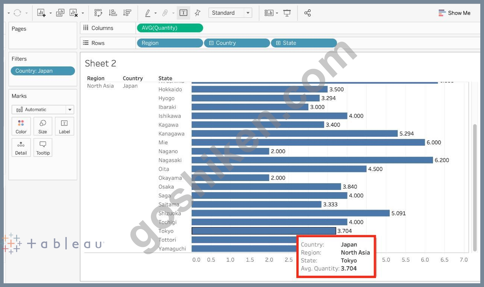
Now that you think of it, EVEN IF YOU REMOVE THE REGION, THE ANSWER REMAINS THE SAME.
Such elements will be present in the actual exam too, just to make the question sound a little difficult, but actually it is pretty straightforward :)
質問 # 79
箇条書きを使用する理由は次のうちどれですか。
- A. 将来の売上予測
- B. 実際の売上と目標売上の比較
- C. 特定の期間の傾向を分析する
- D. 売上高の前年比成長を表示
正解:B
解説:
Explanation
A bullet graph is a variation of a bar graph developed to replace dashboard gauges and meters. A bullet graph is useful for comparing the performance of a primary measure to one or more other measures. Below is a single bullet graph showing how actual sales compared to estimated sales.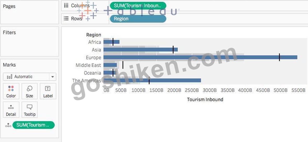
質問 # 80
事務用品カテゴリーで最も利益が少なかったサブカテゴリーはどれですか?
- A. ファスナー
- B. 封筒
- C. ラベル
- D. バインダー
正解:A
解説:
Explanation
To reach the correct answer, follow the steps below: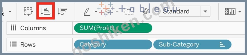
1) Drag Category, and sub-category to the row shelf. Drag Profit to the Column shelf
2) Click the Sort-ascending icon as shown above, to sort the profits from least to greatest as shown:
Click the 'Show mark labels icon'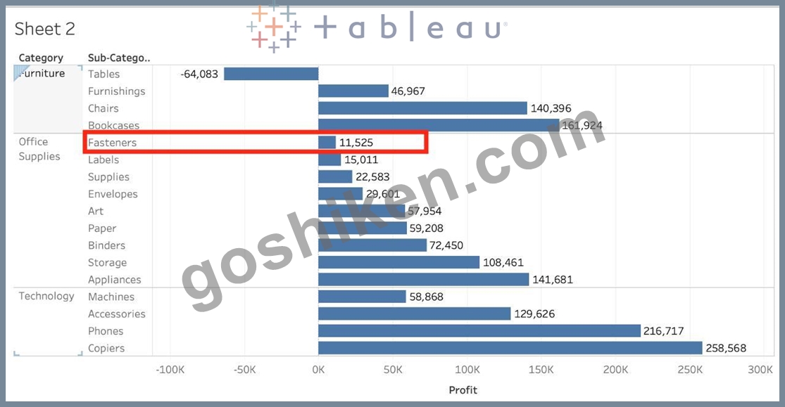
As we can see, Fasteners has the least Profit in the Office Supplies Category, and hence is our correct answer!
質問 # 81
ワークシートの視覚化を画像としてコピーする有効な方法は次のうちどれですか?
- A. キーボードのControl + Vをクリックするだけです
- B. 上のTableauメインメニューで[ワークシート]をクリックし、[コピー]-> [画像]を選択します
- C. ワークシートの視覚化を右クリックし、[コピー]-> [画像]を選択します
- D. マークシェルフを使用して[コピー]-> [画像]を選択します
正解:B、C
解説:
Explanation
The following are 2 correct ways to copy the worksheet visualisation as an image: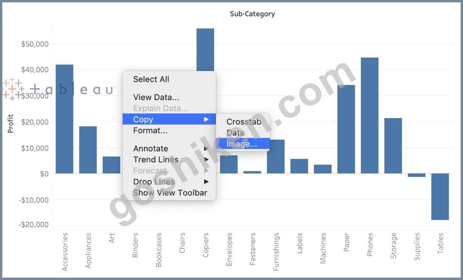
AND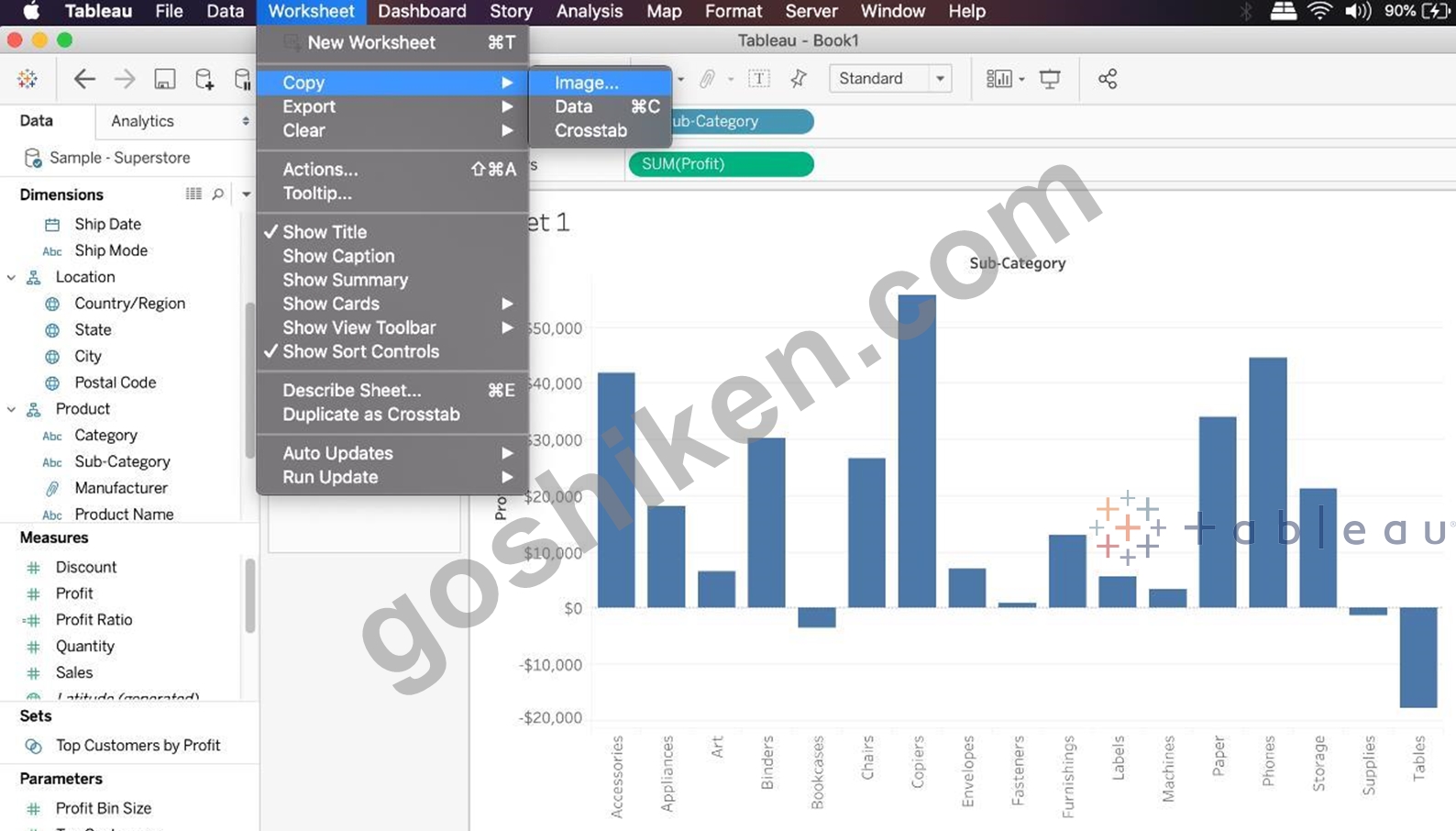
質問 # 82
Tableauの「演算の優先順位」によると、最初に適用されるフィルターは次のうちどれですか?
- A. ディメンションフィルター
- B. コンテキストフィルター
- C. 抽出フィルター
- D. メジャーフィルター
正解:C
解説:
Explanation
According to Tableau's order of operations, the Extract filter is right at the top of the hierarchy. The data filtered in the Extract is then passed on to what we see in the Data Pane. See below: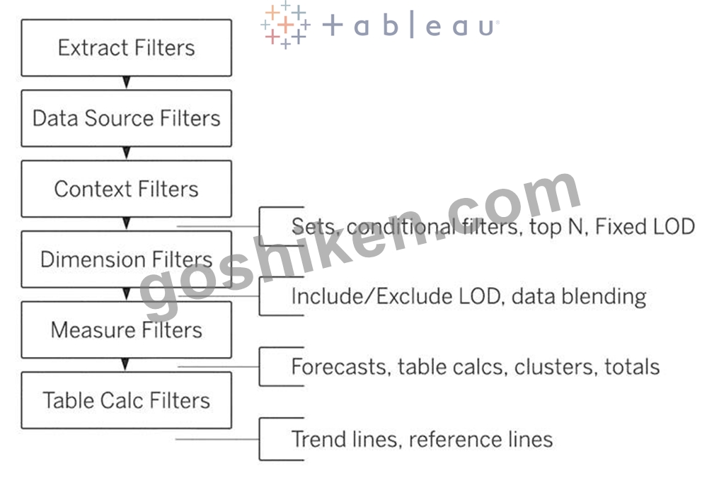
質問 # 83
正誤問題:近似曲線は数値フィールドまたは日付フィールドでのみ使用できる
- A. 偽
- B. 本当
正解:A
解説:
Explanation
You can show trend lines in a visualization to highlight trends in your data.
To add trend lines to a view, both axes must contain a field that can be interpreted as a number. For example, you cannot add a trend line to a view that has the Product Category dimension, which contains strings, on the Columns shelf and the Profit measure on the Rows shelf.
However, you can add a trend line to a view of sales over time because both sales and time can be interpreted as numeric values.
質問 # 84
CoffeeChainテーブルを使用して、州ごとの総経費を示すクロス集計を作成し、列の総計をビューに追加します。次に、ニューヨーク州、カリフォルニア州、ワシントン州をグループ化します。このグループは総売上高の何パーセントを占めていますか?
- A. 23.39%
- B. 27.73%
- C. 25.79%
- D. 29.49%
正解:B
解説:
Explanation
We need to use the concept of Groups for this question. Follow along:
1) First, Drag State to the Rows shelf, and Total Expenses to the Text Mark on the Marks Shelf: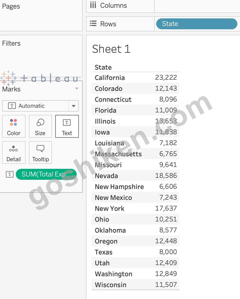
2) Now, remove the SUM aggregation from Total Expenses, and add a quick table calculation -> Percent of total: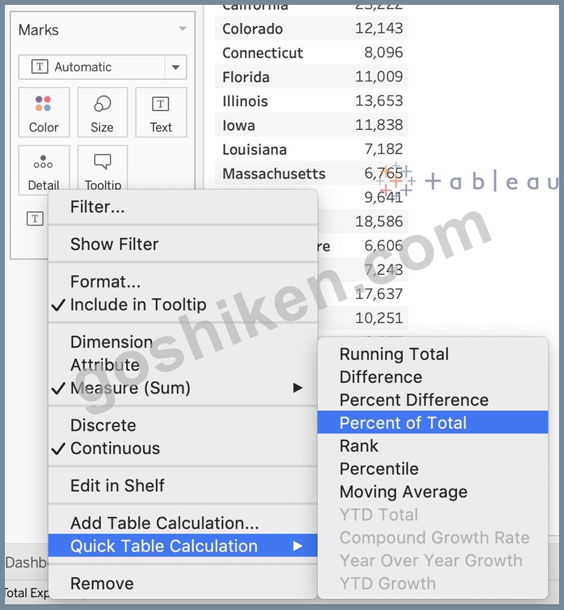
3) Next, Select the States of New York, California and Washington -> And then click the paperclip icon: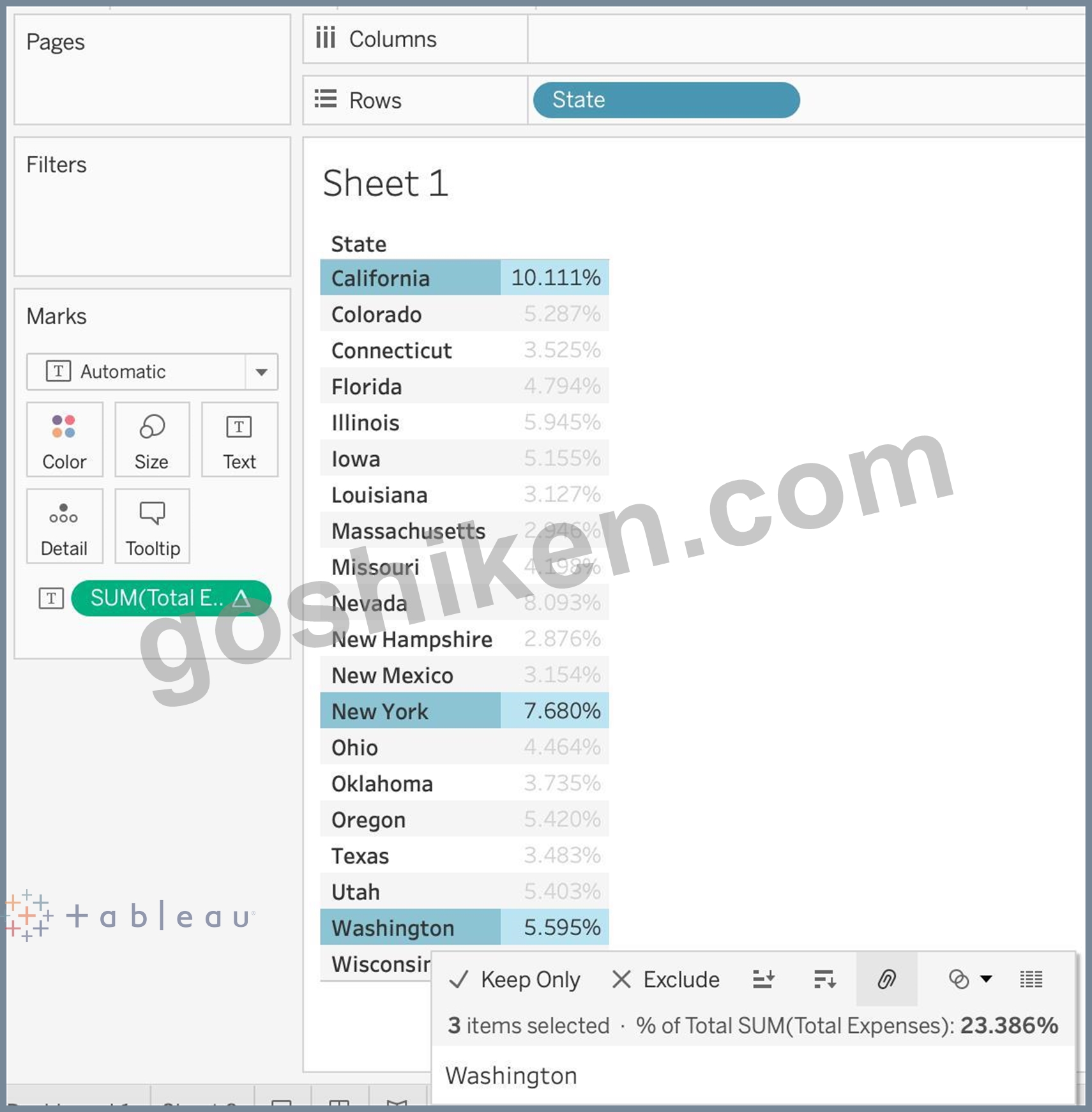
We can see the answer already : 23.386% in the view above (even before grouping!)
4) Finally, we get the following view and our answer: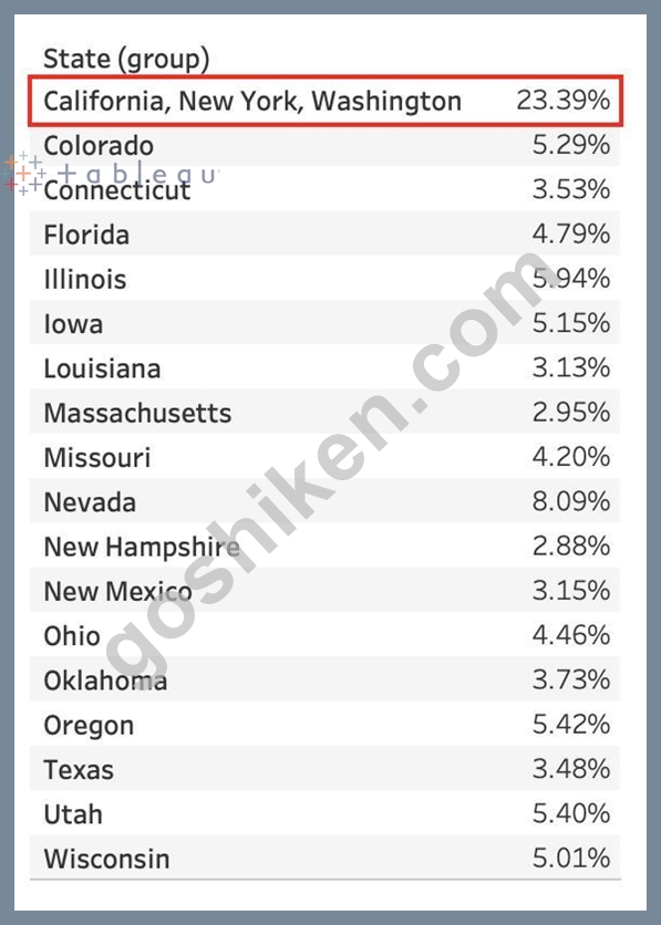
質問 # 85
正誤問題:ディメンションの地理的役割を変更することが可能
- A. 偽
- B. 本当
正解:B
解説:
Explanation
A geographic role associates each value in a field with a latitude and longitude value.
Assigning a geographic role based on the type of location (such as state versus postcode) helps ensure that your data is plotted correctly on your map view. For example, you can assign the City geographic role to a field that contains a list of city names.
To assign a geographic role to a field:
In the Data pane, click the data type icon next to the field, select Geographic Role, and then select the geographic role you want to assign to the field.
When you assign a geographic role to a field, Tableau adds two fields to the Measures area of the Data pane:
Latitude (generated) and Longitude (generated).
These fields contain latitude and longitude values and are assigned the Latitude and Longitude geographic roles.
If you double-click each of these fields, Tableau adds them to the Columns and Rows shelves and creates a map view using the Tableau background map.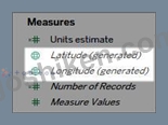
質問 # 86
以下からデータセットをダウンロードします。
https://drive.google.com/file/d/12AYHfiPWkwBmvH0zbumOURgUX6Az00Rw/view?usp=sharing時系列テーブルを使用して、時間の経過に伴う売上を示す折れ線グラフを作成します。どの月と年が最低の売上を目撃しましたか?
- A. 2017年12月
- B. 2018年3月
- C. 2018年1月
- D. 2017年9月
正解:C
解説:
Explanation
Follow the steps to get the correct answer : January 2018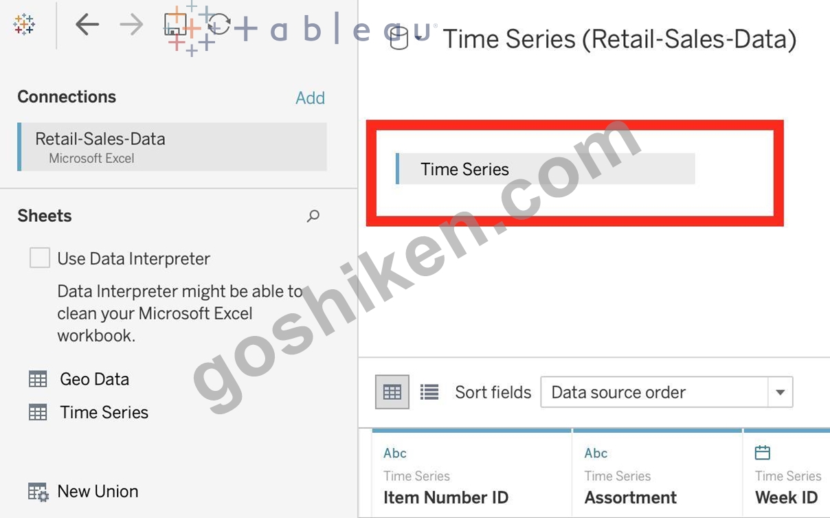
* We are talking about dates, so use the Time series sheet as follows:
* Next, the following should be your view and clearly, January 2018 is the lowest point: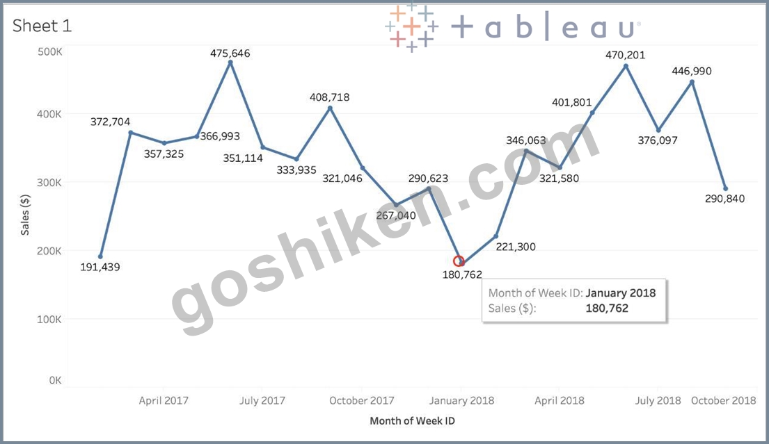
Read more about dates:
https://interworks.com/blog/rcurtis/2017/01/30/tableau-deep-dive-dates-introduction-dates/
質問 # 87
Tableau Serverの実稼働での使用に推奨されるRAMの最小量はどれくらいですか?
- A. 16GB
- B. 8GB
- C. 64GB
- D. 32GB
正解:D
解説:
Explanation
The computer on which you are installing or upgrading Tableau Server must meet the minimum hardware requirements. If the Setup program determines that your computer does not meet the following requirements, you will not be able to install Tableau Server.
These minimum requirements are appropriate for a computer that you use for prototyping and testing of Tableau Server. They apply to single-node installations and to each computer in a distributed installation.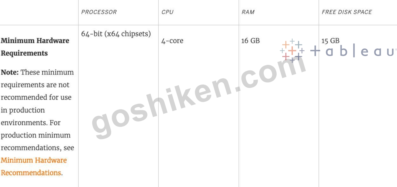
質問 # 88
____________ソートの場合、データがどのように変更されても、値は常に、保持したソート順のままになります。
- A. 階層
- B. トポロジカル
- C. マニュアル
- D. ランダム
正解:C
解説:
Explanation
For a manual sort, no matter how the data changes, the values will always stay in the sort order you kept stuff in.
From the official website: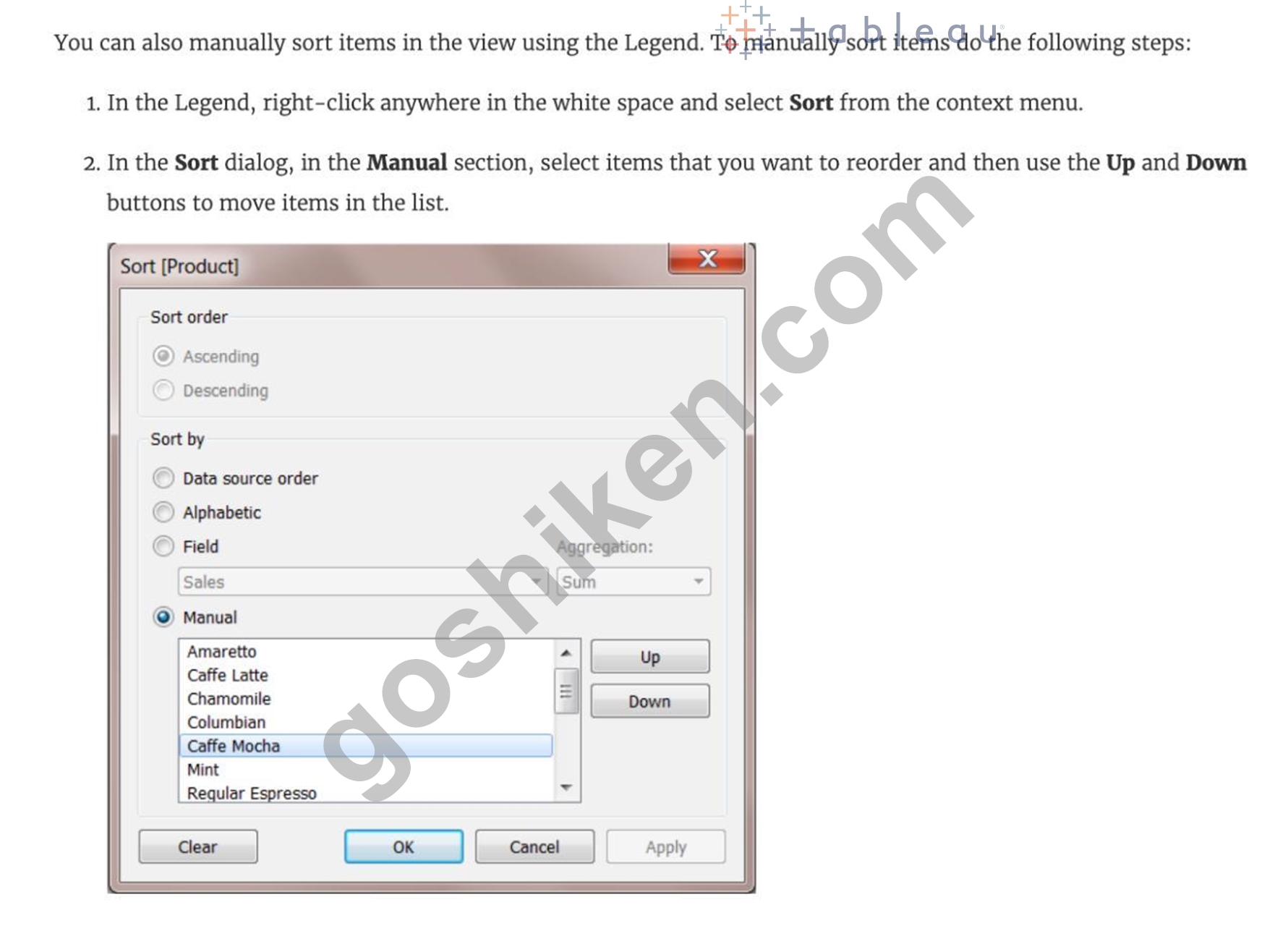
質問 # 89
デフォルトのTableauリポジトリの場所をどのように変更できますか?
- A. リポジトリの場所を手動で必要な場所に移動する
- B. [ウィンドウ]-> [リポジトリの場所]をクリックします
- C. [ファイル]-> [リポジトリの場所]をクリックして、新しい場所を選択します
- D. [ヘルプ]-> [リポジトリの場所の変更]をクリックします
正解:A
解説:
Explanation
According to the official Tableau documentation: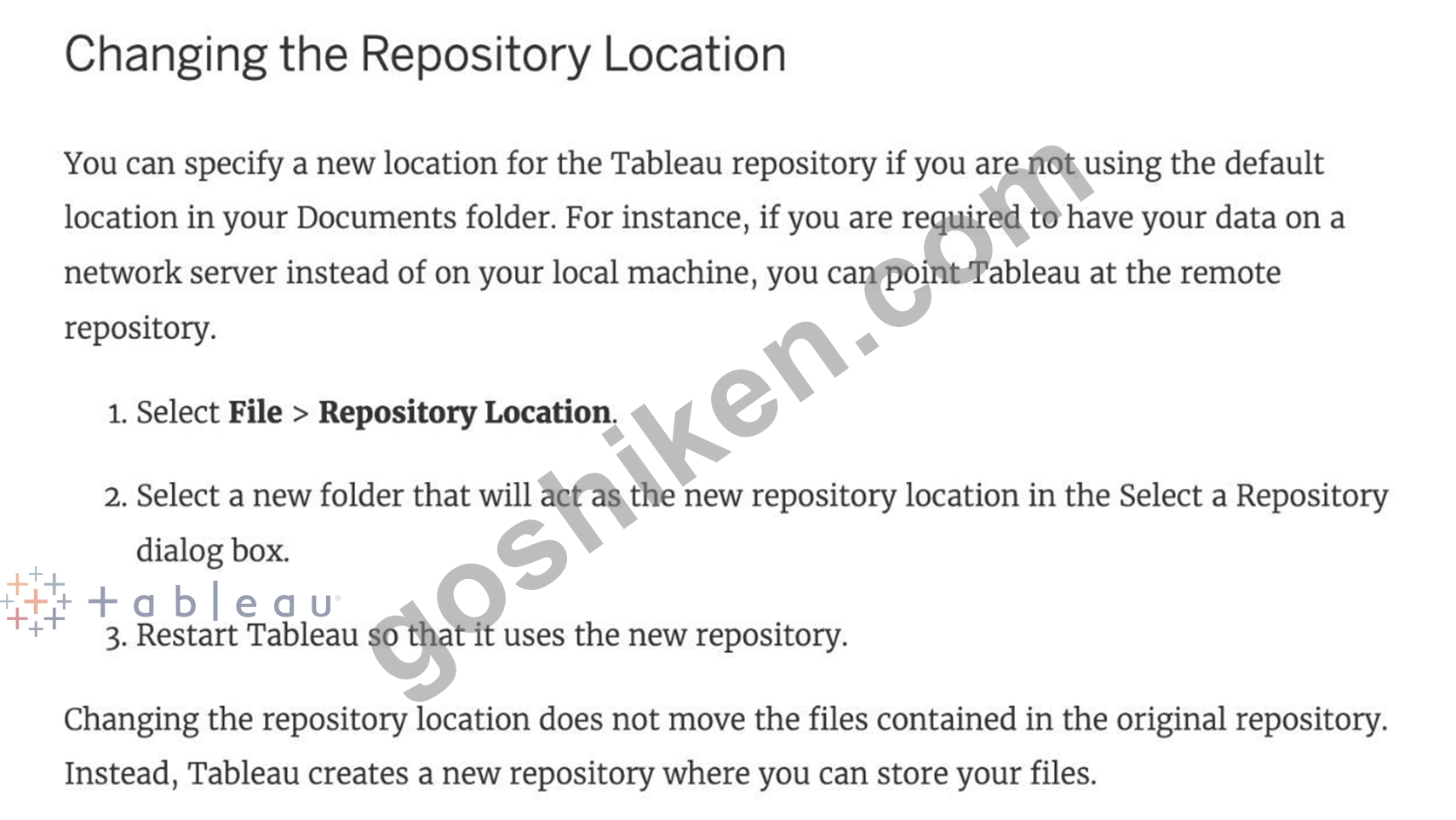
質問 # 90
あるテーブルから別のテーブルに値(行)を追加することで、データを_______________して2つ以上のテーブルを組み合わせることができます。
- A. 連結
- B. ユニオン
- C. 参加
- D. ブレンド
正解:B
解説:
Explanation
You can union your data to combine two or more tables by appending values (rows) from one table to another.
To union your data in Tableau data source, the tables must come from the same connection.
For example, suppose you have the following customer purchase information stored in three tables, separated by month. The table names are "May2016," "June2016," and "July2016."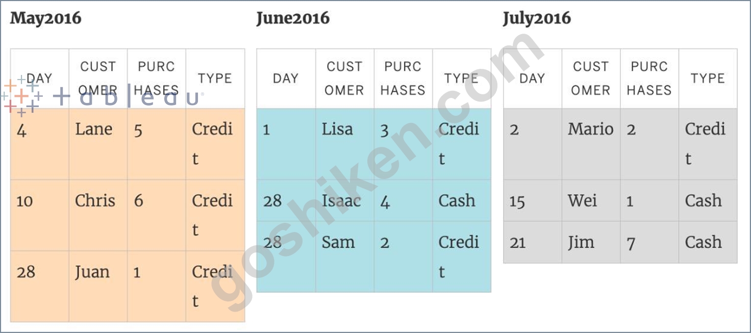
A union of these tables creates the following single table that contains all rows from all tables.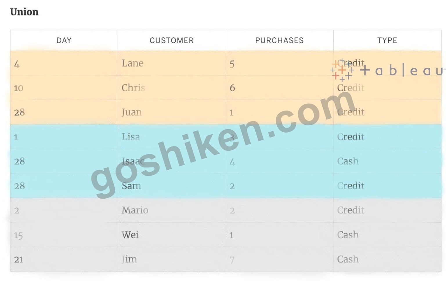
質問 # 91
マップが与えられた場合、次のフィールドのどれをサイズ、形状、詳細、色に配置できますか
- A. 経度、国、州、売上高
- B. 地域、国、利益、州
- C. 売上高、州、国、利益
- D. 利益、州、レコード数、売上高
正解:C
解説:
Explanation
Since Sales is a measure, it can easily be depicted via size.
To drill down and change the level of detail, Country is the correct choice since it will contain STATE. We can then depict the various states by different shapes such as circle, square etc.
Finally, the Profit can be depicted via a color! Eg - Red for poor and green for excellent profits!
質問 # 92
次のグラフの種類のうち、常に降順で並べ替えられた棒が含まれているのはどれですか?
- A. 積み上げ棒グラフ
- B. ガントチャート
- C. パレート図
- D. 円グラフ
正解:C
解説:
Explanation
A Pareto chart is a type of chart that contains both bars and a line graph, where individual values are represented in descending order by bars, and the ascending cumulative total is represented by the line.
On the primary axis, bars are used to show the raw quantities for each dimension member, sorted in descending order.
On the secondary axis, a line graph is used to show the cumulative total in percent format.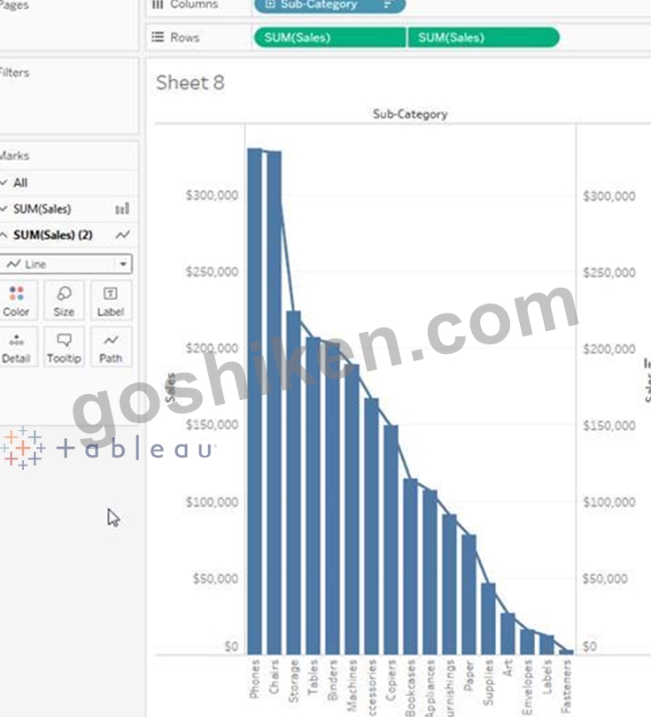
質問 # 93
はいまたはいいえ:ビューの寸法の数を増やすと、マークの数が増えます
- A. はい
- B. いいえ
正解:A
解説:
Explanation
Of course! As an example, see below:
1) Using the Sample Superstore data, let's plot a bar chart showing the Sales for each Category: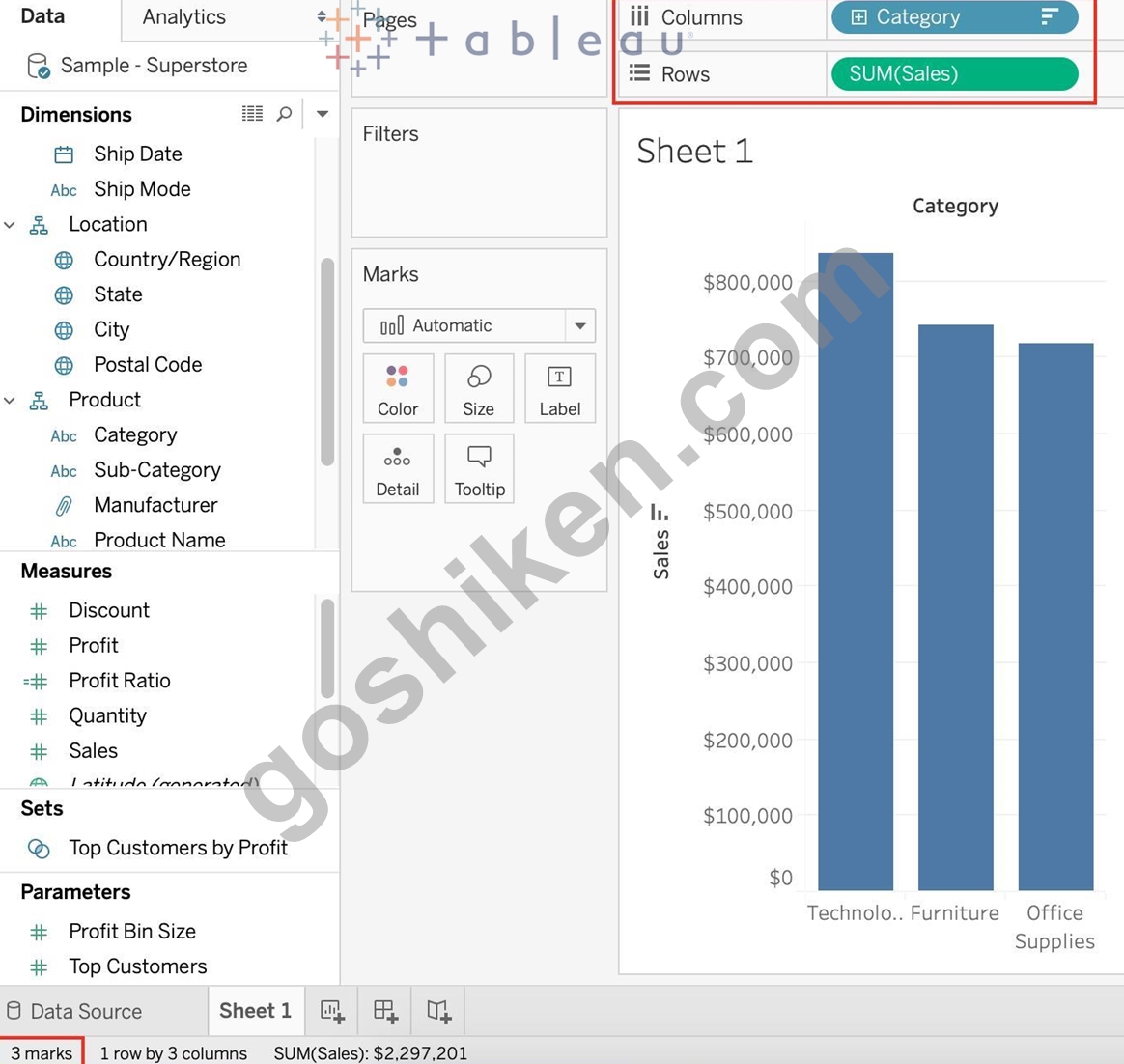
Observe that we have 3 marks - Each bar in a bar chart is called a mark. Similarly, each point in a scatter plot is also a mark , and so on for all charts.
1 row by 3 columns means that clearly on the y-axis (Sales), we have only a single mark - a single continous axis, but 3 different marks (Technology, Furniture and Office supplies ) on the x-axis.
2) Now let's add subcategory to the view as well (another dimension):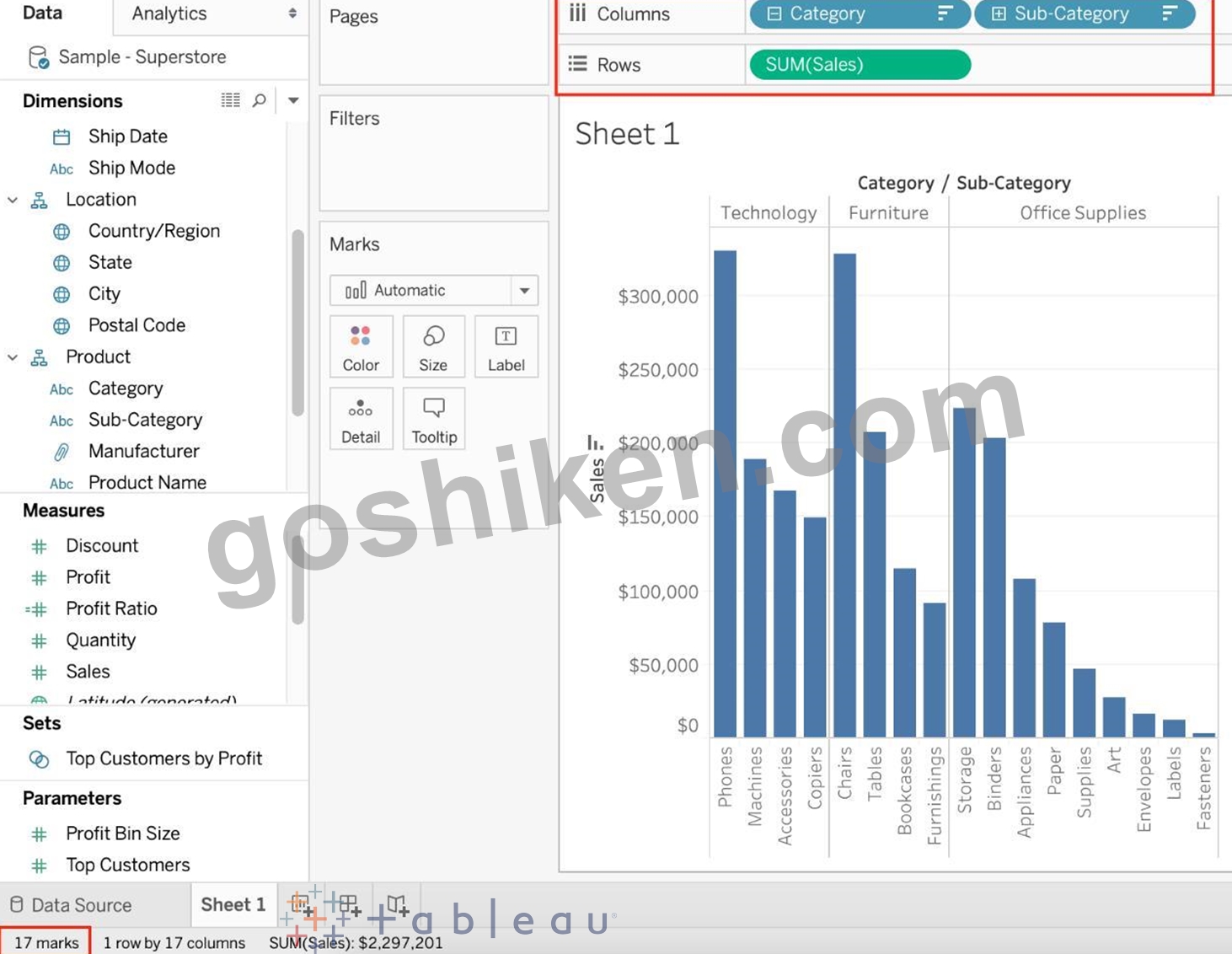
Observe that the number of marks has increased - i.e the number of Bars.
Also, notice we now have 1 row and 17 columns. Simply because 1 row = Sales (on the y-axis), and on the x-axis, we have 17 different columns (i.e product sub categories!!)
質問 # 94
......
今すぐDesktop-Specialist日本語問題を使おうDesktop-Specialist日本語問題集PDF:https://www.goshiken.com/Tableau/Desktop-Specialist-JPN-mondaishu.html